

Improving the home dashboard and weekly certification form flow to reduce confusion and friction for users
I explored what restructuring areas of the BEACON platform would look like to give users a clearer path to understanding their benefits and completing the weekly certification process. By restructuring the dashboard and simplifying the form flow, I created an experience that could reduce friction and confusion during a stressful and time-sensitive task.
Role
Tasks & Deliverables
COLLABORATORS
Client industry
View site

refine the home dashboard and weekly certification flow to reduce friction when completing the form and support a more intuitive journey through the platform.
[01] INTRODUCTION
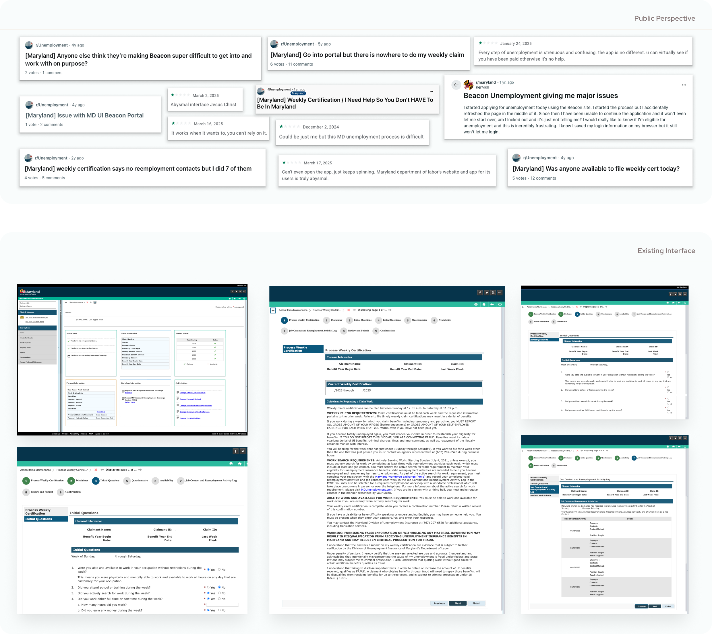
Looking for work post-layoff introduces you to a lot of tools, sites, and interfaces that you get very familiar with, very fast. One of those platforms for me was the Maryland Department of Labor Unemployment Insurance BEACON system. From registration to weekly certifications, it became clear quickly that this was a platform that could use some updates. It's clunky, confusing, and all over the internet, people expressed their frustrations. So as a designer, I figured, who better to reimagine and refine this process?
[02] AUDIT & DEFINING SCOPE
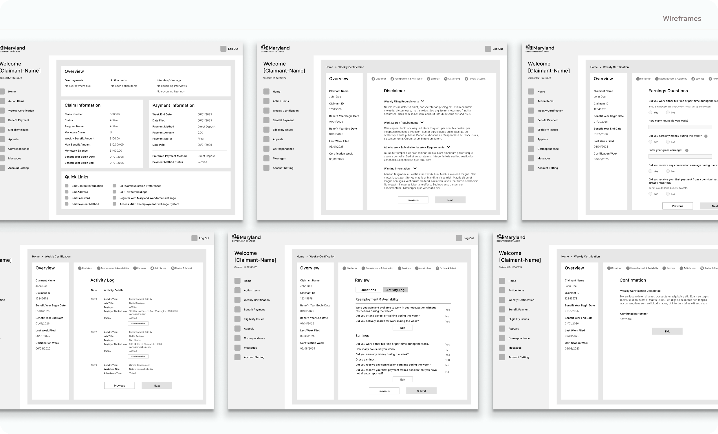
I wanted to start by taking a look at the existing platform from the perspective of a user to identify places for improvement. In thinking about my experience and interactions with the platform, I concluded that the home page and the weekly certification forms are where I would focus. The home page is where a user would land as soon as they log in. It's a place that holds a lot of information and guides how a user's journey starts. Additionally, the weekly certification is used (as it says in the name) weekly. It's a section of the site that sees high traffic, multiple interaction, and a section that has always frustrated me personally. So with that in mind, I decided it would be another place to improve.
[03] UX STRATEGY & DESIGN
After defining the focus for this project, I began to look at the home screen and certification flow to identify what issues users might have with it and how they could work better for them. To do this, I outlined a hypothetical user interview and user journey to better understand the target audience.
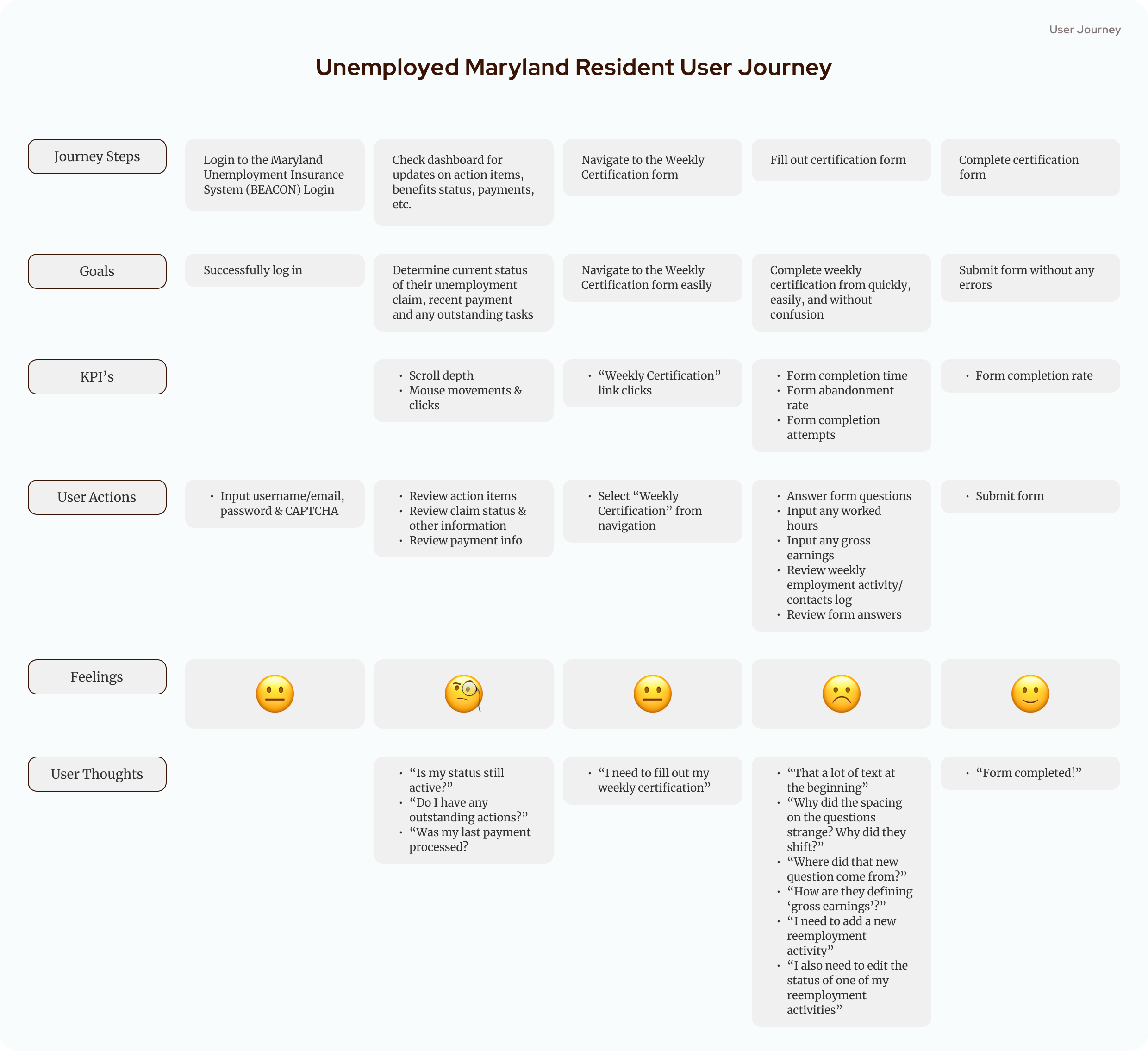
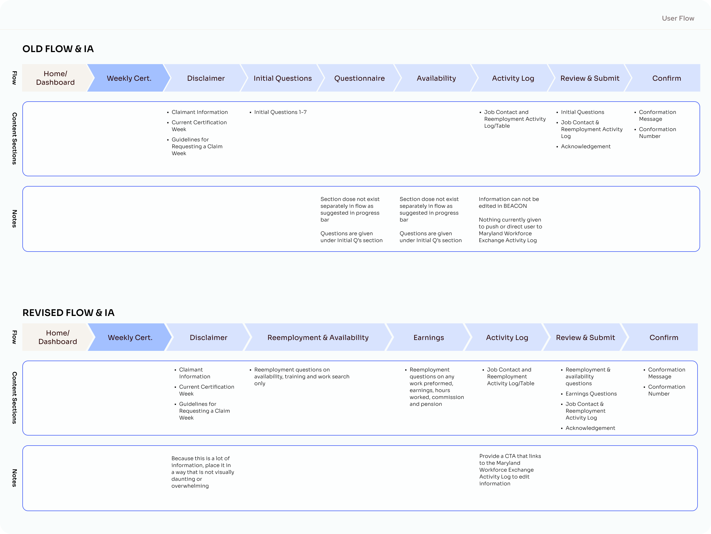
I also mapped out the steps of the certification flow. This gave me the opportunity to look at this section's IA and see what sections needed adjustments to better fit the needs and journey of the user. This process, plus my initial audit, helped me identify the following pain points:
→ Information Overload: Landing on the dashboard, you're bombarded with sections and information. They all appear to have the same level of importance, and for new users, especially, it can seem overwhelming. As you then move to the first page of the weekly certification form, you're met with a wall of text that is poorly organized and visually exhausting, priming user to enter the form experience with a negative impression
→ Form Progress Confusion: While progress trackers in forms are good, the organization of this one is a bit confusing. Its step tracker doesn't match the number of screens a user goes through, the sections that are referenced are not clearly marked, and as a result, the user might get the impression that the system has missed or skipped sections. Additionally, certain questions appear only when certain answers are given, and that creates a jarring user experience.
→ Cross-Platform Connectivity: This form pulls information from another state platform; however, you can not seamlessly navigate between them through the platform, which users might want to do to edit information relevant to that week's employment activities.
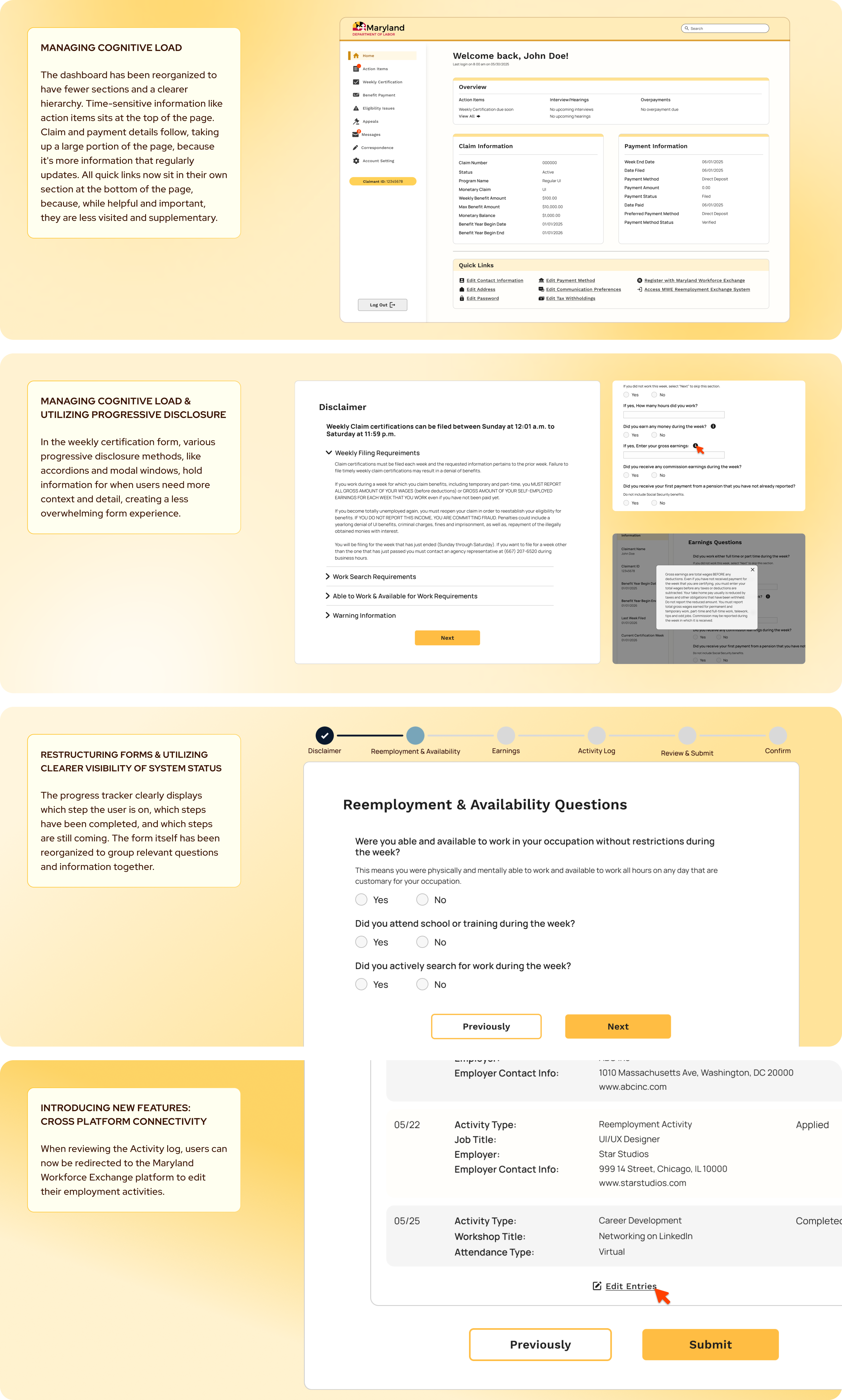
This process helped uncover my goals for the redesign: refine the IA and hierarchy of these sections of the platform, reduce visual fatigue, and modernize the experience. With this, I created wireframes of what the new dashboard and updated flow of the form would look like, using that as a scaffolding for the UI.
was to simplify the dashboard layout and streamline the weekly certification flow so users can start their journey with more clarity and fill out the form with less confusion.
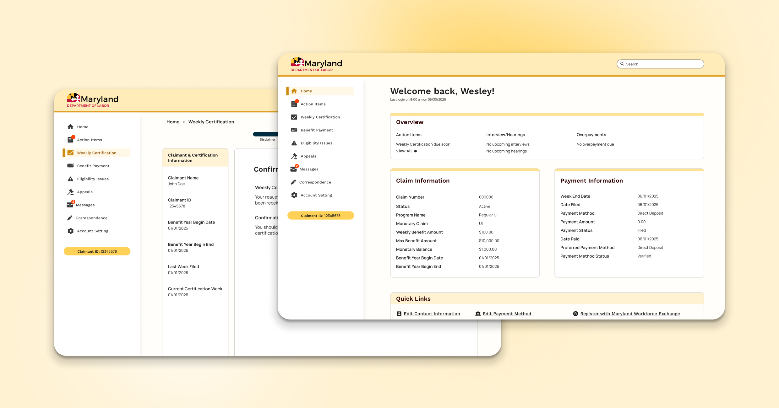
[04] FINAL DESIGN
The home page/dashboard takes on a simpler design, using variations of the primary yellow tone and a more straightforward structure between the sections. The weekly certification flow screens are a lot cleaner and simpler, and use the bold, bright yellow for the CTAs to clarify navigation throughout the flow. The dark blue tone is introduced in the progress bar at the top so that there is a clear indication of the user's progress throughout the flow, but it doesn't command the same visual attention as the buttons.
[06] REFLECTIONS
The MDOL BEACON system was launched in September 2020. Several years later, the platform has seen lots of users and has lots of room for updates. With a quick timeline like the one I set for myself, I wasn't able to drive deep into areas of the site, explore the mobile app, and see how each section interacts with each other. There is also another platform, Maryland Workforce Exchange, that interacts with this platform, and I believe there is a lot of opportunity to explore how the two sites' interactions can be improved.
If I had more time, resources, and even a team to work with, I think interviewing existing users of the platform would make a huge difference in how the final product come out. While I can get an idea of their perspective by looking at public forums, that gives insights into only the perspective of a small vocal subsection of users. The variety and range of its users have a large impact on the final experience and can shape the final product.