
A logo reflective of the advancements in human tissue origination science
Role
Tasks & Deliverables
COLLABORATORS
Client industry
View site

.gif)
[01] THE TASK
Auregen was a new company looking to develop a logo and establish its brand identity. As an apprentice, I joined the design team to help develop logo ideas for the client. The client was inspired by the visuals in the Westworld open theme and wanted their logo to reflect feelings and concepts of innovation and the forward-thinking nature of their science.
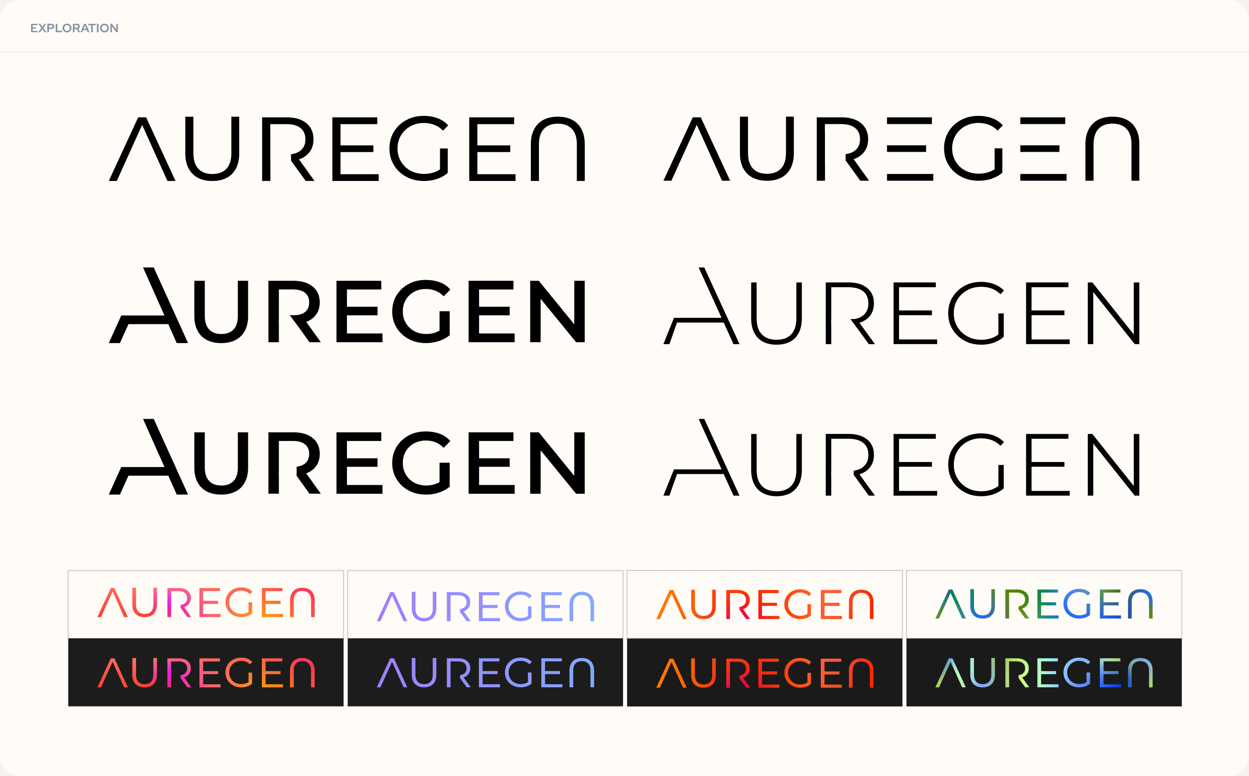
[02] LOGO EXPLORATION & ITERATION
Early explorations of this logo leaned into workmarks that felt striking and strong but still precise. I explored using negative space to create the letters that make up the logo, a nod to Auregen's scientific process of regenerative medicine and tissue biofabrication. I also explored how color could be used to show their transformative science. With all this in mind, the final logo resulted in into a mark that is simple yet striking and futuristic.
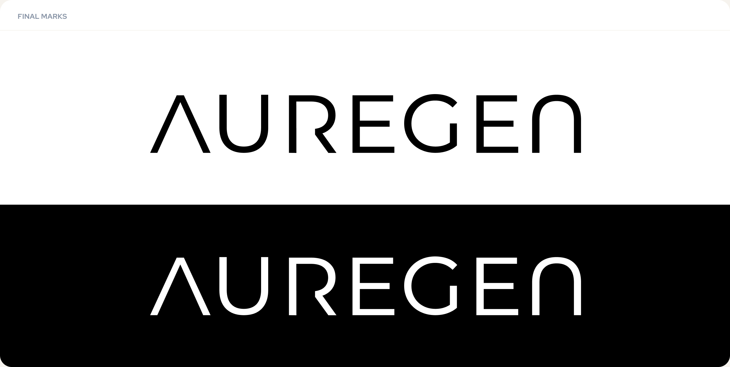
[03] THE FINAL LOGO
The final logo uses clean lines and angles to reflect the innovative and precise nature of what Auregen does. Taking inspiration from real-world things like 3D printers and precision pointers, the form of the A, R, and, G evoke a futuristic feeling to the wordmark. It also maintains a level of elegance with the curved edges in the N and U that are reflective of, not only other elements of the brand's visual identity but also, the anatomical focuses within Auregen's work.

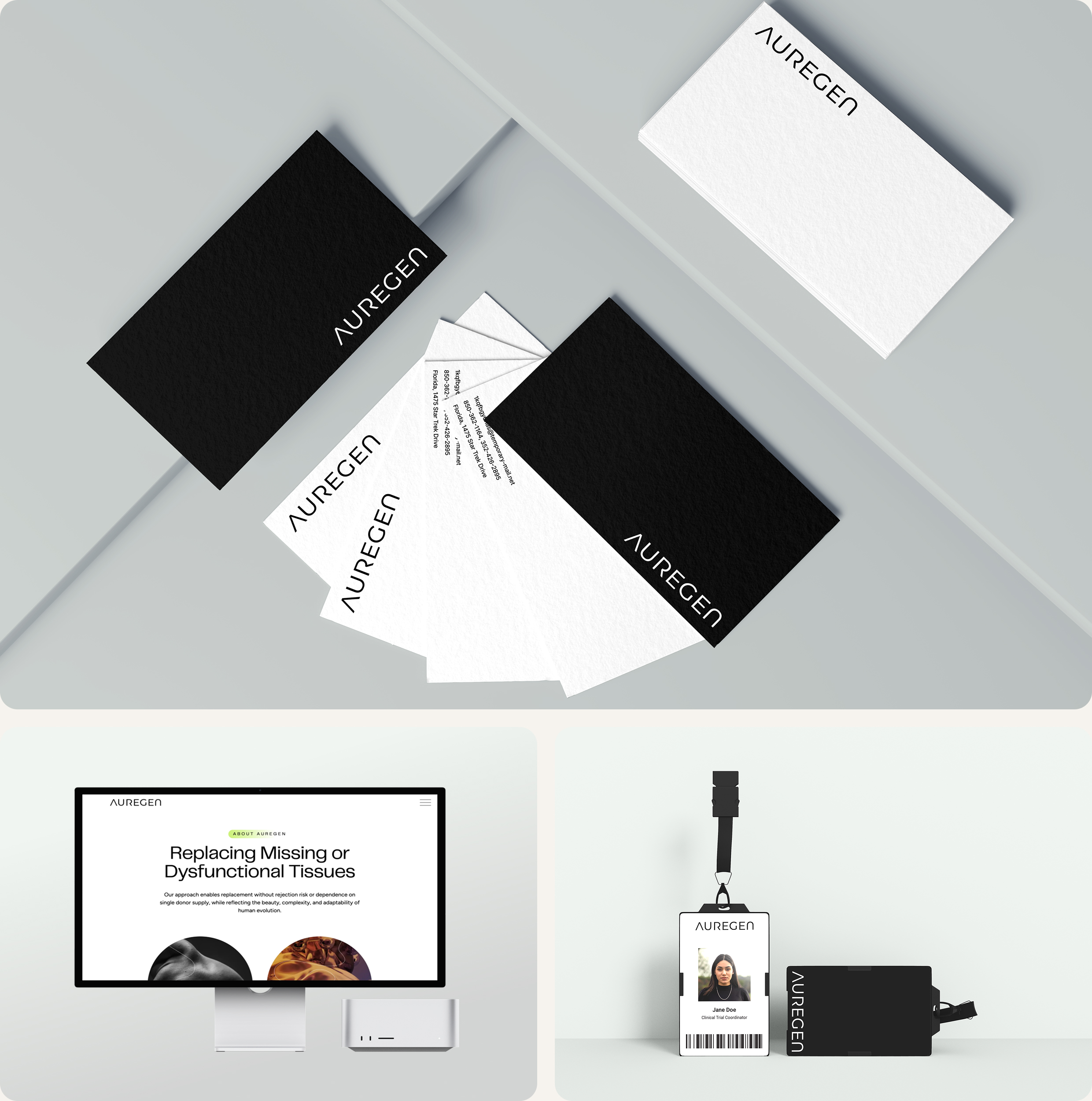
[04] LOGO APPLICATIONS
The final logo was used in various applications, including business cards, letter heads, on the main website and in other collateral. The simple design allows for the final logo so scale nicely and be used effectively at different sizes. Because the client decided to stick to just black and white logo variations, it can also be used on a variety of backgrounds while still meeting accessibiliuty standards.