
Reinventing a visual language to showcase the product's impact on business outcomes and reflect mission, background, and market leadership
Role
Tasks & Deliverables
COLLABORATORS
Client industry
View site


[01] THE TASK
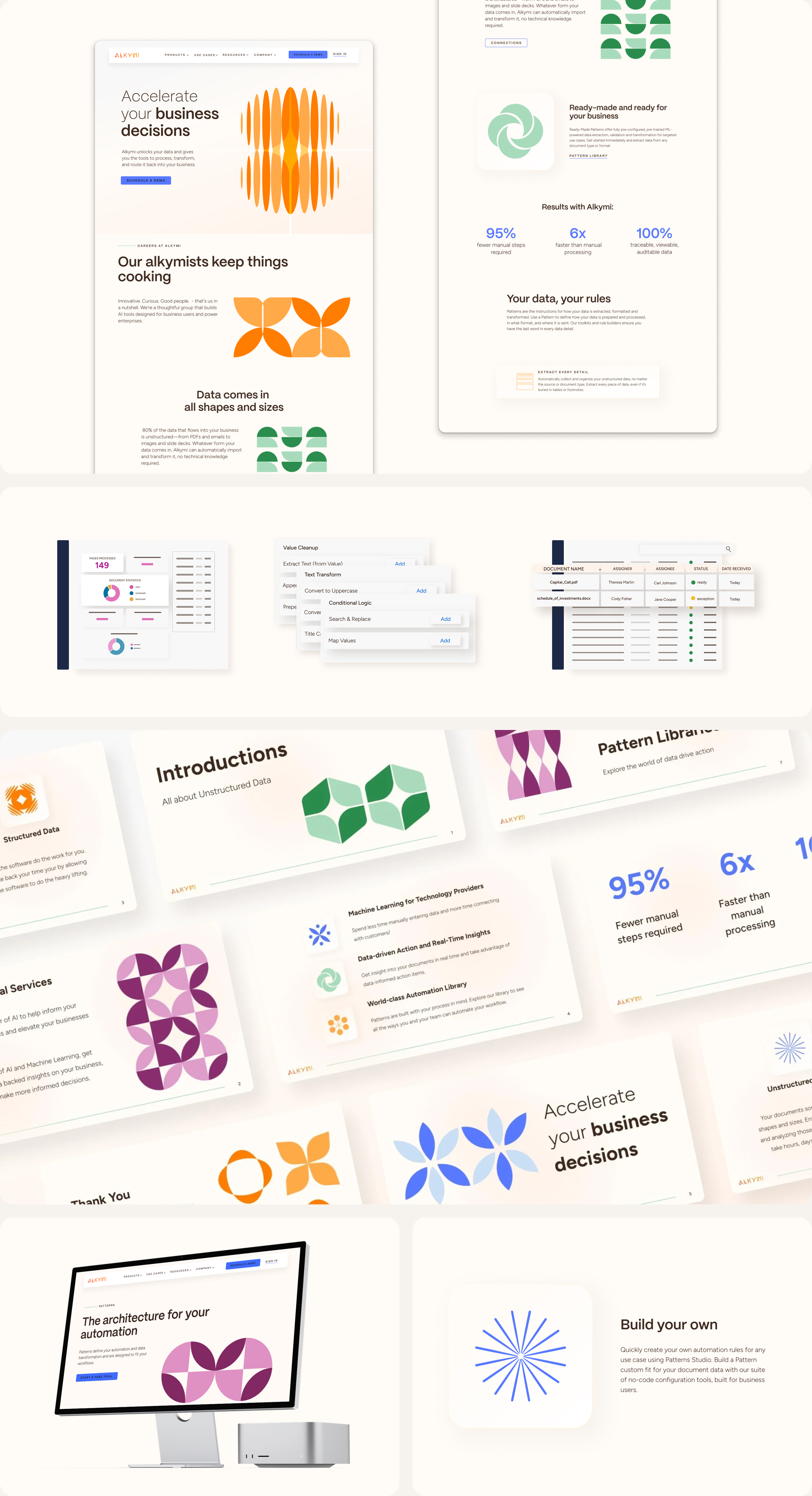
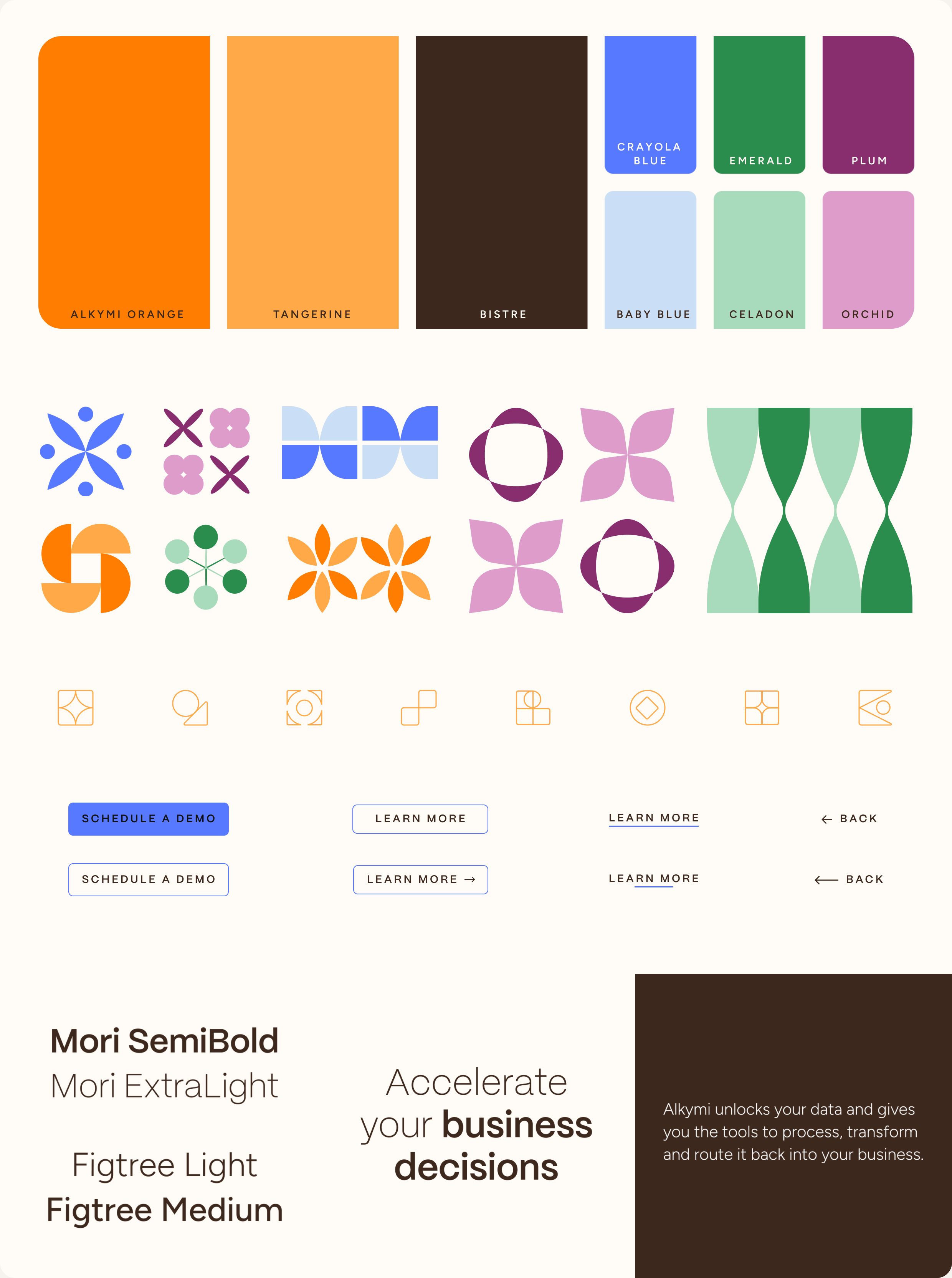
Alkymi was looking to refresh its brand with a new website and visual language. The Alkymi team was inspired by one of the founders Danish background and was looking for something more modern. Through a thorough brand audit and exploration process, I developed a visual language for them that utilized unique shapes and patterns, a reference to their Patterns product, and a fresh color palette that took inspiration from the original brand and their product.
[03] THE FINAL BRAND
The final brand uses abstract patterns made out of simple shapes that help establish and illustrate concepts core to the brand's mission. The company's refreshed color palette sets it apart in the fintech space and leans into the goal of the product, supporting companies, and liberating and accelerating decision-making. The site utilized these elements of the brand's new visual identity to create pages and layouts that lead the viewer through the goals and features of the company and product. The final brand update established a system and visual language that has since been expanded out and used in explainer videos, social media assets, and larger-scale material.