
A logo showcasing reflective relationships in biologic medicines
Role
Tasks & Deliverables
COLLABORATORS
Client industry
View site

.gif)
[01] THE TASK
As a new company, Abiologics needed a brand and logo developed to emerge out of stealth. As a designer on this project team, I created several logo concepts and variations that spoke to their mission, science, and vision for the company.
[02] LOGO EXPLORATION & ITERATION
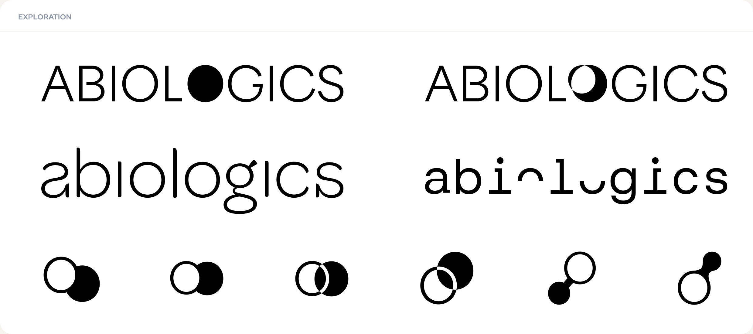
Early explorations for the logo were looking at ways to express the concepts of mirror proteins and biologic and abiologic products. I played around with wordmarks of different typefaces, weights, cases and letterform modifications, exploring what felt representative of the brands message and position before landing on something in all caps, medium weight, with subtle adjustments to different letter forms that could also be extracted to create a logo mark.
[03] THE FINAL LOGO
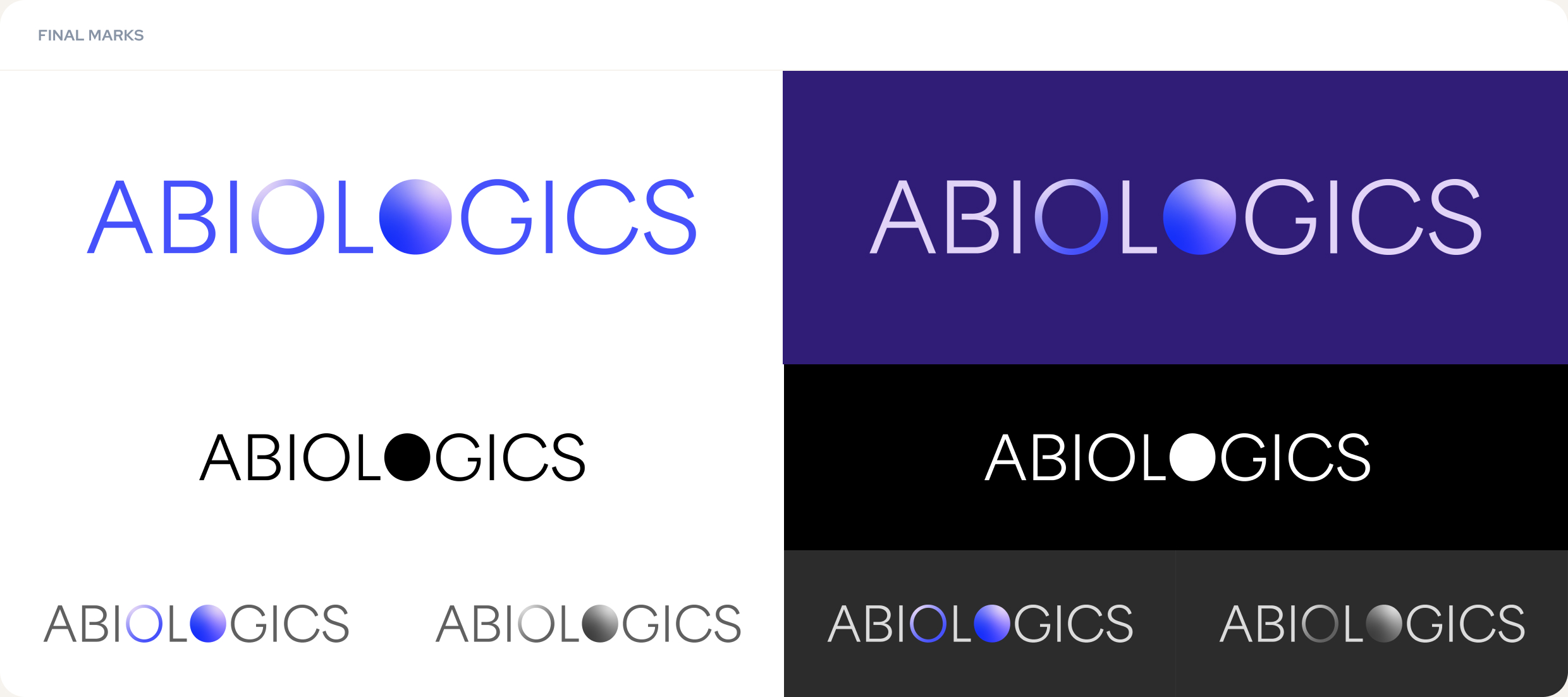
Abiologic's logo speaks to the concept of biologics and "abiologics". Using the "L" in the middle of the name as a mirror or symmetry point, the two O's reflect each other in style and orientation symbolizing the connection, transition, and transformation between the existing and evolving science central to Abiologics work. The second O is filled in completely to display the full and abundant possibilities present as a result of Abiologics platforms and science. In all, the Abiologics logo speaks to the transformative and novel nature of their work.

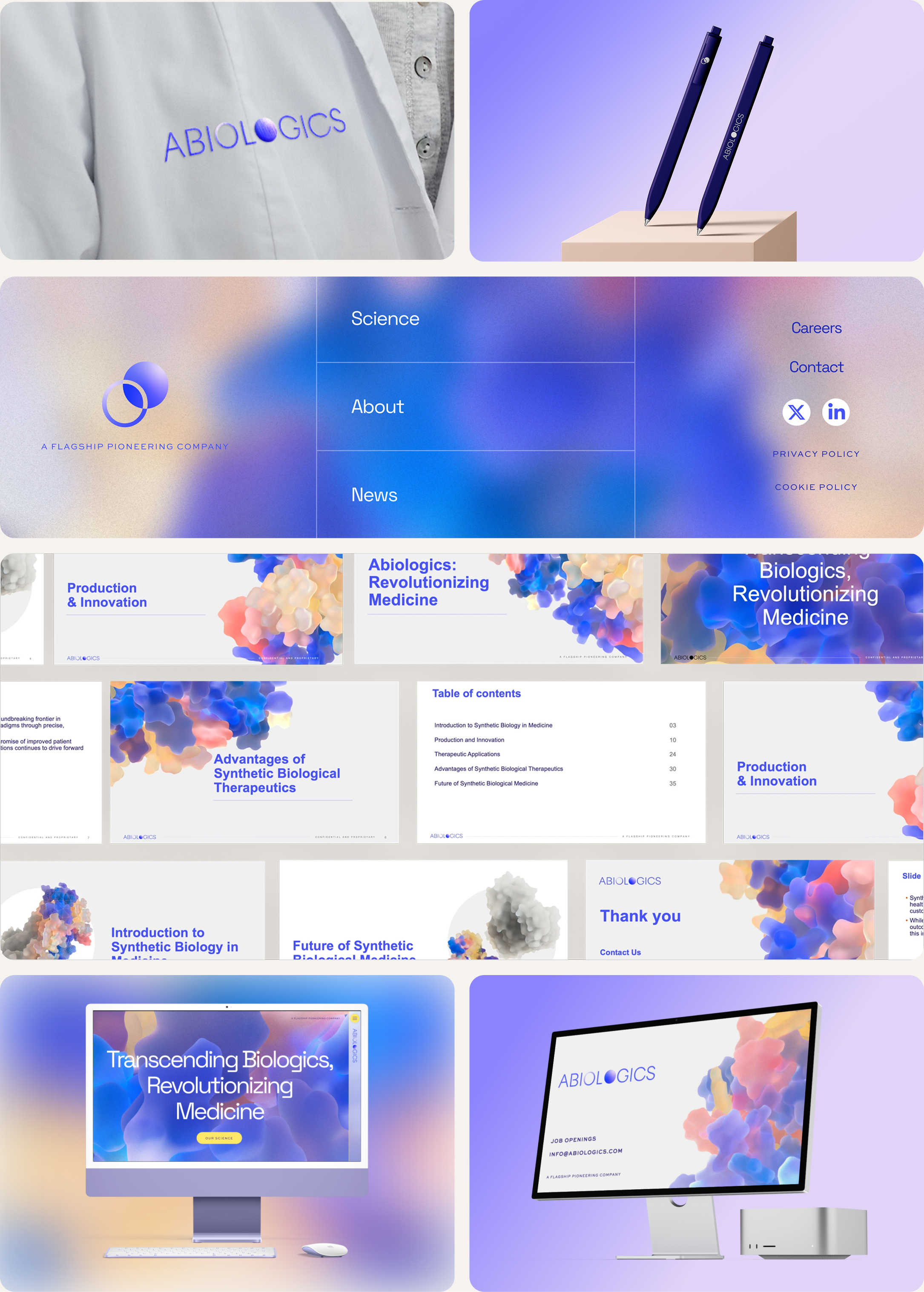
[04] LOGO APPLICATIONS
This logo is used in various spaces and mediums such as web, print, social media, signage, and company merchandise. Along with other logo variations (solid color, grayscale, dark and light background variants), the final logo was also expanded on to include a motion variation that was used on the splash page ahead of the company's launch, on social media, and in other promotional material.
I explored the logo and mark in various mediums and contexts. The logo mark allows for more environments and mediums to incorporate the logo like in the footer of the website. The final mark is used throughout the final website as well as on the branded presentation slides I created for the Abiologics team.